Duffl
A UX redesign and brand update that increased purchase conversion by 12%.
UX Design
Branding
OVERVIEW

Tailoring Quick Delivery UX to College Students

In the competitive landscape of food delivery services, Duffl emerged as a distinctive player by focusing specifically on the needs of college students. Delivering convenience foods and student essentials in under 10 minutes, Duffl operates with a uniquely student workforce from dark stores at select universities around the US.

While the original app's scrappy design captured a youthful quirkiness that made the brand what it is today, the evolving market demands highlighted the need for a strategic UI/UX facelift and branding refresh. The redesign aimed to target critical drop off points in the conversion funnel, while reinforcing Duffl’s unique value proposition to its college audience. This case study illustrates how a strategic overhaul of the information architecture and checkout flow led to a notable 12% increase in conversion rates across all customer segments.
THE PROBLEM

Addressing Critical User Drop-Off

Both session recordings and quantitative data analysis revealed significant drop-offs in Duffl’s shopping experience, particularly at the "add to cart" and "view cart" stages. The app's difficult navigation and endless vertical scrolling within the product catalogue led to unnecessary cognitive load and decision fatigue, deterring students from ever starting a cart. Additionally, a lengthy checkout process resulted in high rates of cart abandonment. These insights highlighted critical areas for improvement to enhance the shopping and checkout experience, crucial for retaining our student users.
abandoned without cart
52%
abandoned
cart
21%
overall purchase conversion
35%
The old UI
CONSTRAINTS

Tight Timeline and a Codebase Transition

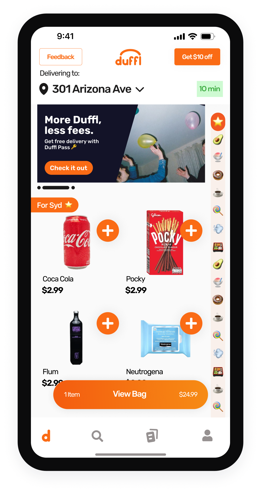
Switching Platforms with a Lean Team
Faced with a tight two-month timeline, our team, comprising one designer and two engineers, embarked on a comprehensive redesign of our food delivery app. A significant part of this project involved transitioning the app from iOS Swift to React Native, which provided a unique opportunity to simultaneously overhaul the UI/UX and update Duffl’s branding. The shift also enabled us to ship updates faster and offer an Android app.
De-risking Decisions with User Research
A significant risk with our redesign was the potential loss of insight into the quantitative data on how each specific change affected user behavior. To address this, I conducted a comprehensive research phase, analyzing session recordings, holding user interviews, and running usability tests to methodically validate (or invalidate) each hypothesis before moving forward with the designs. This data-driven approach ensured that our redesign decisions were well-informed and closely aligned with user needs, enabling us to proceed with confidence.
DESIRED OUTCOMES

Here’s the predicted outcomes we were designing for —

The behaviors we're driving:
  1. Increased Engagement: By enhancing the user interface with more intuitive navigation and a simpler checkout process, we aimed to encourage deeper interaction with the app and a more inspirational shopping experience.
  2. Higher Conversion Rates: The more engaging shopping experience and simplified checkout process aimed to minimize friction and lead more users to complete their purchases, thereby improving conversion rates.
  3. Increased Average Order Value: By introducing task-oriented organization to the shopping experience and improving product visibility through better categorization, we expected to encourage users to explore more items and make additional purchases, thereby increasing the average order value as a second order effect.
The behaviors we're discouraging:
  1. Decision Fatigue: The previous infinite scroll feature often overwhelmed users, leading to decision fatigue. The redesign aimed to replace this with a more structured discovery process, where search, categories, and curated lists provide targeted options without overwhelming users.
  2. Cart Abandonment: By integrating the checkout into a single screen and applying the "investment-first" approach, we aimed to minimize user effort and increase early commitment. Designing for reduced friction and fostering engagement at the initial stages, thereby discouraging cart abandonment. improving conversion rates.
  3. Passive Browsing: The old UI encouraged aimless scrolling, which historically led to >50% drop off before a cart was started. The new design discourages this by promoting active engagement and decision-making through the revamped Discover page, offering inspiration and carefully tailored recommendations to align with users' immediate needs and contexts.
THE PROCESS

Here’s how we did it —

Discovery
Wireframes
User Testing
Iterate
Develop
Having maintained a consistent practice of user interviews throughout my time at Duffl, I was intimately familiar with the critical user journeys and personas using the app. I spoke to several top customers and conducted co-design sessions with them to shape the initial wireframes. We used a hypothesis tracker to validate or invalidate our assumptions throughout the process, ensuring that our design choices were grounded in user feedback and data.
Given the need to rebuild the entire app as we transitioned from iOS Swift to React Native, we seized the opportunity to unify our codebase and enhance the user experience. We tested the final prototypes with a round of top customers, incorporating their feedback to refine the design. Once validated, we proceeded to build the streamlined shopping and checkout process, ensuring our redesign was both user-centric and efficient to develop.
THE SHOPPING EXPERIENCE

Discovering Three User Journeys

After our initial discovery phase, we discovered the three critical user journeys for students coming to the Duffl app. In the revamped design, the home screen supports all three key user journeys, all accessible above the fold to maximize efficiency and engagement.
The “Need” Journey (Search):
  • To improve user experience, we relocated the search bar from the second tab on the navigation bar to the top of the home screen. This change directly supports new users who are either looking for a specific favorite snack or exploring our inventory. By placing the search bar prominently, these users can quickly find what they need without additional clicks, reducing friction and enhancing their first impression.
  • For returning users with urgent, infrequent needs, such as cold medicine or party supplies, the relocated search bar provides swift access to essential items. Previously, the additional navigation steps could cause delays and frustration. Now, with the search bar at the top of the home screen, these users can immediately search and purchase necessary items, significantly improving their satisfaction and reducing time-to-purchase.
The “Want” Journey (Categories/Subcategories):
  • To enhance the user experience for those who visit Duffl with a craving for specific categories like sweets or cold drinks, we moved the categories to the second option under the search bar on the home screen. Previously located on the second tab of the navigation bar, this change makes it easier for frequent visitors to quickly access their desired categories.
  • We optimized the categories by reducing them from 21 to 8 main categories, reorganizing items within them into subcategories through card sorting exercises with our users. This simplification aligns with Miller's Law, which states that the average person can only hold about seven items in their working memory, making navigation more intuitive and manageable. Additionally, this provides new users with an at-a-glance overview of the types of products we carry, exposing them to different use cases and enhancing their first visit experience.
The “I Don’t Know What” Journey (Scrolling):
  • The original design supported aimless scrolling, leading to decision fatigue and a 52% drop-off rate before users even started a cart. While vertical scrolling was familiar to our users, it needed to be more engaging and interactive for those without a specific category in mind.
  • To address this, we introduced a "Discover" page to replace endless scrolling with curated lists tailored to college student lifestyles, such as study breaks or game day essentials. This approach shifts users from passive scrolling to active discovery, fostering a more engaging and inspirational shopping experience. This redesign aims to reduce decision fatigue, shorten shopping times, and keep users engaged, ultimately encouraging them to start a cart and complete their purchases.
Each of these journeys is intentionally designed to minimize user effort and maximize discovery, aligning the user experience with distinct needs and contexts, and reducing the cognitive load for all types of users.
The old "browse" page
The new "discover" page
THE CHECKOUT EXPERIENCE

Checkout Reimagined: One Screen, Effortless Gestures

To address cart abandonment, we decided to simplify our checkout process, both to reflect user behavior and for the added benefit of accelerating development speed. The innovative one-screen checkout, enhanced by intuitive swipe gestures, streamlined the checkout flow and contributed to a 12% boost in conversion.
Original Checkout Flow:
  • Two-step process typical in e-commerce.
  • Step 1: Review cart, items, subtotal, and fees.
  • Step 2: Move to "review order" to check delivery/payment details and tip before confirming purchase.
Issues Identified:
  • Poor visual hierarchy in original design.
  • High rates of abandoned carts.
  • Excess clicks observed via data analysis and session recordings.
User Behavior Insights:
  • Top users frequently order to the same location with the same payment method.
  • Minimal need to review details with each purchase.
  • Users often forget to update delivery address when in a new location, consistently distracted by tip amount at this phase.
Redesign Goals:
  • Streamline the checkout process based on habitual user behavior.
  • Reduce steps to minimize time and cognitive load.
New Checkout Flow:
  • Address Confirmation First: Targets common pain point of updating delivery location. Secures early user investment, priming them for completion.
  • Improved Hierarchy: Guides users to delivery address and payment method at the top for quick verification, followed by cart items, tip options, and subtotals.
  • Cost Transparency: Clearly breaks out costs to alleviate anxiety about hidden fees.
  • Final Confirmation with Swipe: Introduces a swipe action for a more definitive feel, balancing the speed of the checkout process.
Impact
  • Reduced time to checkout.
  • Increased purchase conversion 12% with new app launch.
  • Enabled completion of purchase with just a few intuitive gestures.
Summary
  • We streamlined the checkout process by reducing input requirements and minimizing friction. Our investment-first checkout flow, inspired by Nir Eyal's Hooked Model, positions delivery and payment details input before users review their cart items and totals. This approach increases user investment early in the process, psychologically priming users to complete their purchases, reducing drop-offs, and enhancing conversion rates.
  • We also integrated all checkout steps into a single screen, reducing cognitive load and simplifying navigation. The checkout interface adopts familiar swipe mechanics, allowing users to intuitively swipe the cart up and down with one thumb, similar to interactions in popular social media apps like TikTok. This one-handed interaction is not only convenient but also introduces an element of fun. The 'swipe to purchase' feature adds an enjoyable and engaging way to finalize purchases, enhancing the user experience with a sense of accomplishment. These enhancements leverage psychological principles to engage and satisfy users, encouraging repeat usage and loyalty.
The old checkout flow
The new checkout screen
SOLUTIONS

Here’s what really happened —

Overall Conversion Increase
The redesign and transition to React Native had a significant impact on our conversion rates within days of the release. Overall conversion increased from 35% to 47%, validating our hypothesis that simplifying the user journey and enhancing the checkout process would lead to higher engagement and reduced drop-offs.
Top Customer Segment Conversion Increase
In our top customer segment, conversion soared from 66% to 84%, further supporting our strategy to cater to frequent users and improve their shopping experience.
Improvements to Add to Cart Rate and Cart Abandonment
These improvements indicate a higher add-to-cart rate and reduced cart abandonment, leading to increased overall conversions.
Ongoing Work
Despite the success, we recognize the need to implement front-end events for each step in the conversion funnel with our transition to React Native, including add to cart and cart abandonment. Nonetheless, the impressive increase in conversion rates underscores the effectiveness of our redesigned shopping and checkout process.
CHALLENGES

Not everthing went as planned

Limited A/B Testing
We couldn't A/B test horizontal scrolling versus grid layout for categories in production. However, qualitative testing consistently favored the grid design, even though it takes up more space on the screen.
Granular Event Tracking Loss
Due to time and engineering constraints during the transition, we lost granular event tracking capabilities, impacting our ability to monitor detailed user interactions.
NEXT STEPS

Here’s what we’d work on in future iterations

A/B Test Category Layouts
We couldn't A/B test horizontal scrolling versus grid layout for categories in production. However, qualitative testing consistently favored the grid design, even though it takes up more space on the screen.
Seamless Category Navigation
Redesign the experience within categories to allow switching between them without returning to the home screen.
Personalized Recommendations
Implement machine learning to provide curated categories tailored to individual user behavior, advancing beyond the current per-school basis personalization.